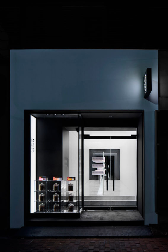
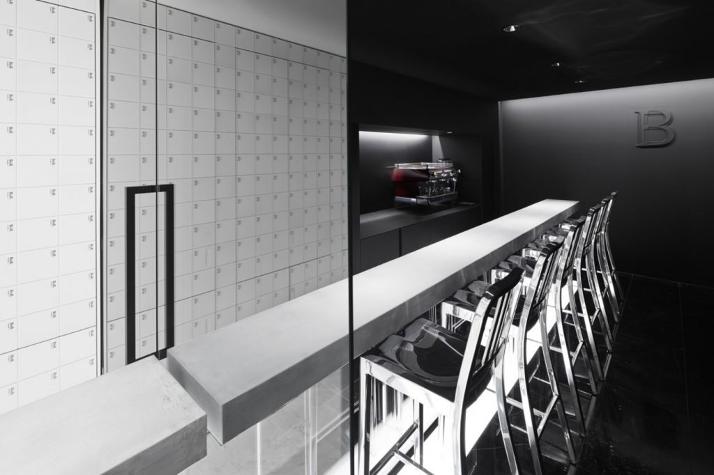
The need for commercial structures to establish a direct link to the concept of the product on sale is clear. In this sense, architectural design and interior space go hand-in-hand and become a signifier of form, offering different experiential concepts to grasp what underlies the product purchase process.
A marvellous example is the BbyB Ginza chocolatier in Tokyo. Nendo studio achieves sensorial delicacy through the boutique’s aesthetic approach, spotlighting a single product: chocolate. Nendo is known for its simple yet ground-breaking designs that always contain an element of surprise. This approach has placed it on the perch of international design.
Is it possible to transmit emotions in designing spaces?
Here at The Decorative Surfaces, we take a look at the form, structure and materials that help BbyB Ginza chocolatier in Tokyo to be an enveloping, sensorial and sublime project. The architecture of the space is imbued with innate special human sensitivity that harks to nostalgia and connectivity through scent.
Discretion through absence
BbyB Ginza is a particularly interesting space in terms of composition and structure. The modulation of the product establishes a block link with the architectural elements. The façade is subtle and discreet. It leads to a space measuring under 50m2 that is structured into three sections divided by glass doors. The lack of ornamentation and monochrome palette help visitors appreciate the product’s presence, as well as provide a deli-style approach. Harmonious glass combines with discreet signage and low lighting that situate the premises beyond the surrounding area’s visual contamination.
Dynamic volumes as a projection of elegance
The play on volumes showcased from the understated façade combines and contrasts with the clean white shading in the entrance hall. In this way, expectation entices visitors in. Once inside, the second module showcases pure elegant white tones.
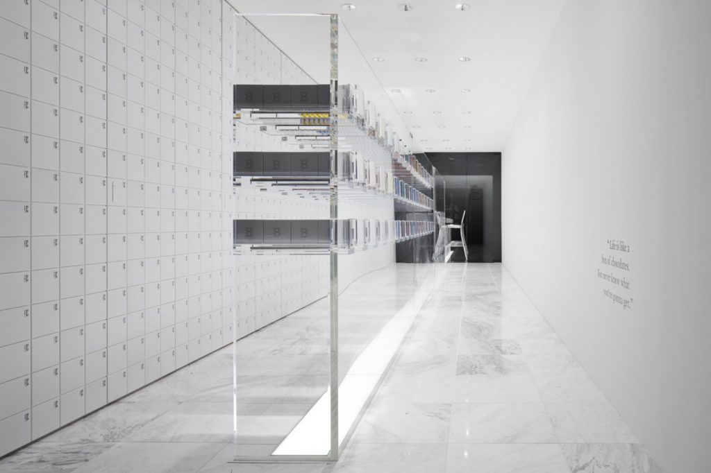
In addition, the magic of methacrylate shelving provides light and underscores an exalted sense of product presence through packaging. The materials in the central space of the second module carefully curate the product’s presentation. Customers slide drawer-like cubes in the same way that they slide the product from its packaging.
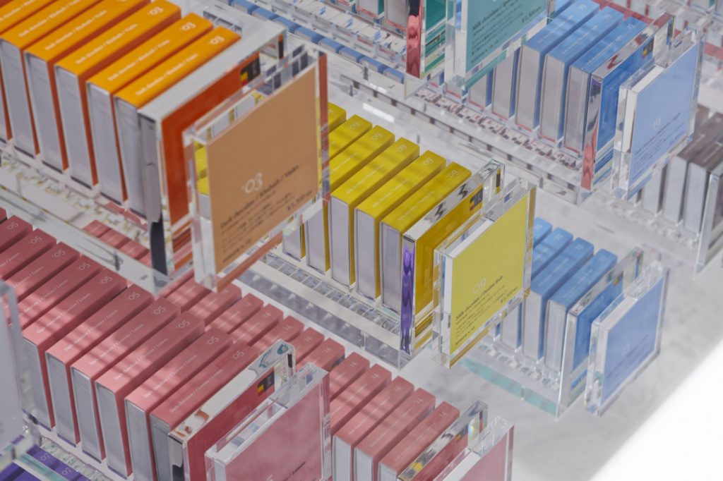
After the entrance hall, a new volume contrast comes into play. This happens through another glass door where tenuous light envelops what is signified. The dark and calm third module is the result of enjoyment and pleasure. We find the space is dedicated to product experience through taste.
The purity of materials
The resolution and understanding of the space have a conceptual sense that is resolved through the purity of the materials in play. Maximum modular contrast can be seen in the central area of the space. The magic provided by the luminosity of white tones creates a sensation of extasy evolving from the expectation created by the muted façade.
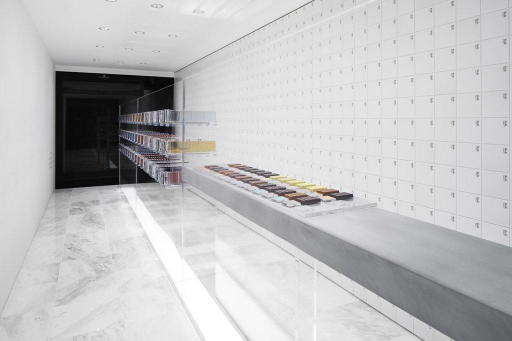
In this sense, product sensation is resolved by using materials such as methacrylate. Nonetheless, it is marble that enjoys a truly starring role since the Carrara Blanco marble floor transmits an enormous sense of worthy purity, cleanliness and capaciousness in the narrow confines. The marble is noiseless and underscores immense quality and distinction. It’s a perfect riposte to the spatial symbiosis.
All this exemplifies how matching architectural design to interior space results in a signifier of form.

