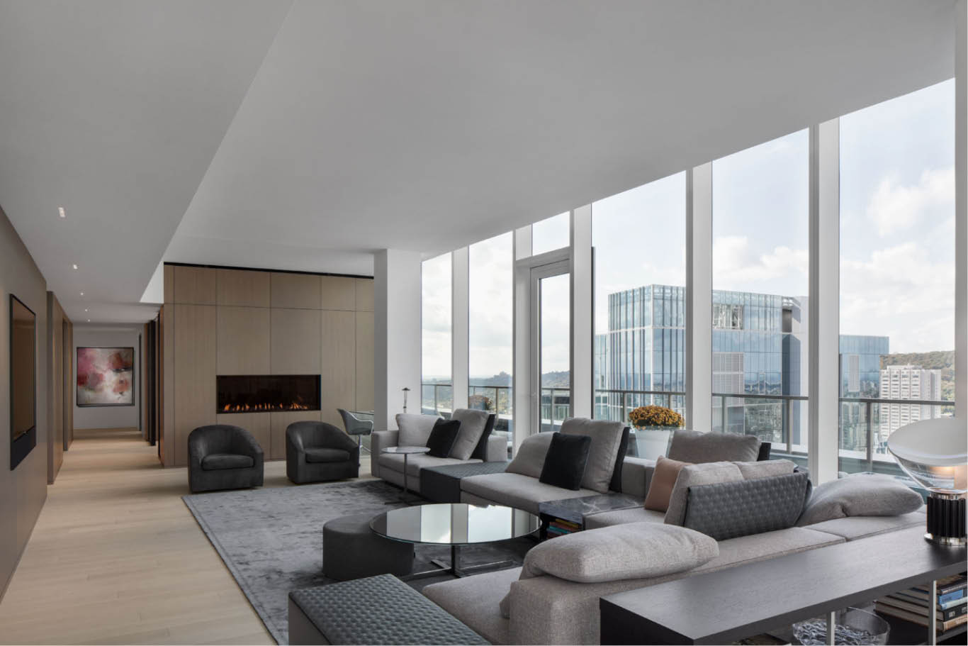
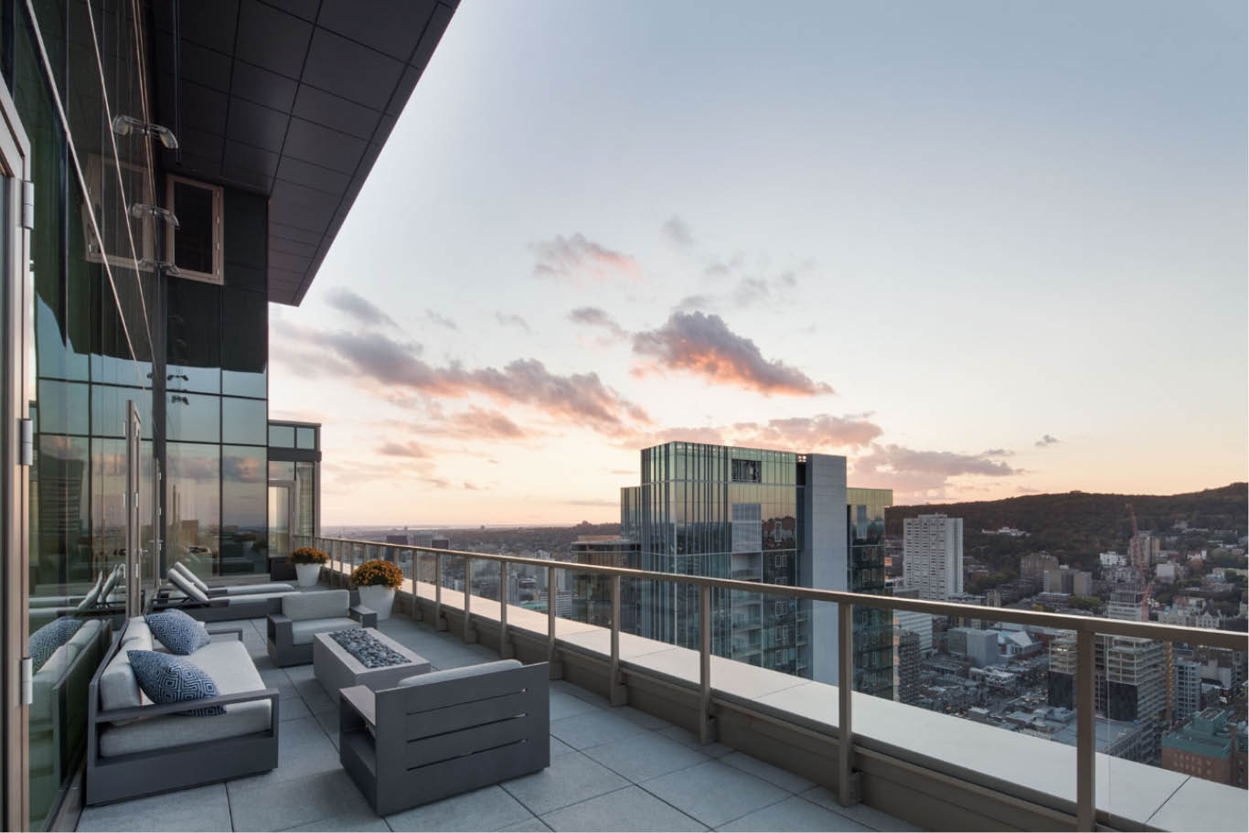
A personable space to live and work in a 40-floor tower in the centre of Montreal. This was the challenge facing the Desjardins Bherer studio in 2017: having to convert an awkward, long, narrow L-shaped space into the ideal home for a local family who were returning to the city after living in California. On the plus side, the property had a huge spectacular terrace with breathtaking views over Mount Royal, alongside near-round glazing that provided lots of light in all the rooms.
The studio had to come up with a way to reorganise the space to adapt it to the requirements of a family with two adolescent children, alongside a workspace for the father. They finally chose a layout that included an open living-dining area, three bedrooms and a home office.
The first room visitors enter is the living area, where wooden wall panelling has been used to create a sense of warmth, as well as a minimalist hearth built into the wall. This space houses a floor-to-ceiling glass wall providing access to the terrace and offering spectacular natural light. On the other side, a television hangs on a wood panel wall that can be enjoyed from a beautiful modular sofa. This feature, alongside the rug and armchairs, uses an elegant grey/blue/black colour palette that perfectly combines with the wood hue. This material and the placement of the different elements help reduce the ‘corridor effect’ that the tower’s elongated design could represent.
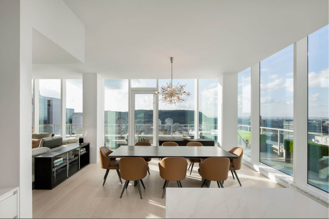
A bright kitchen
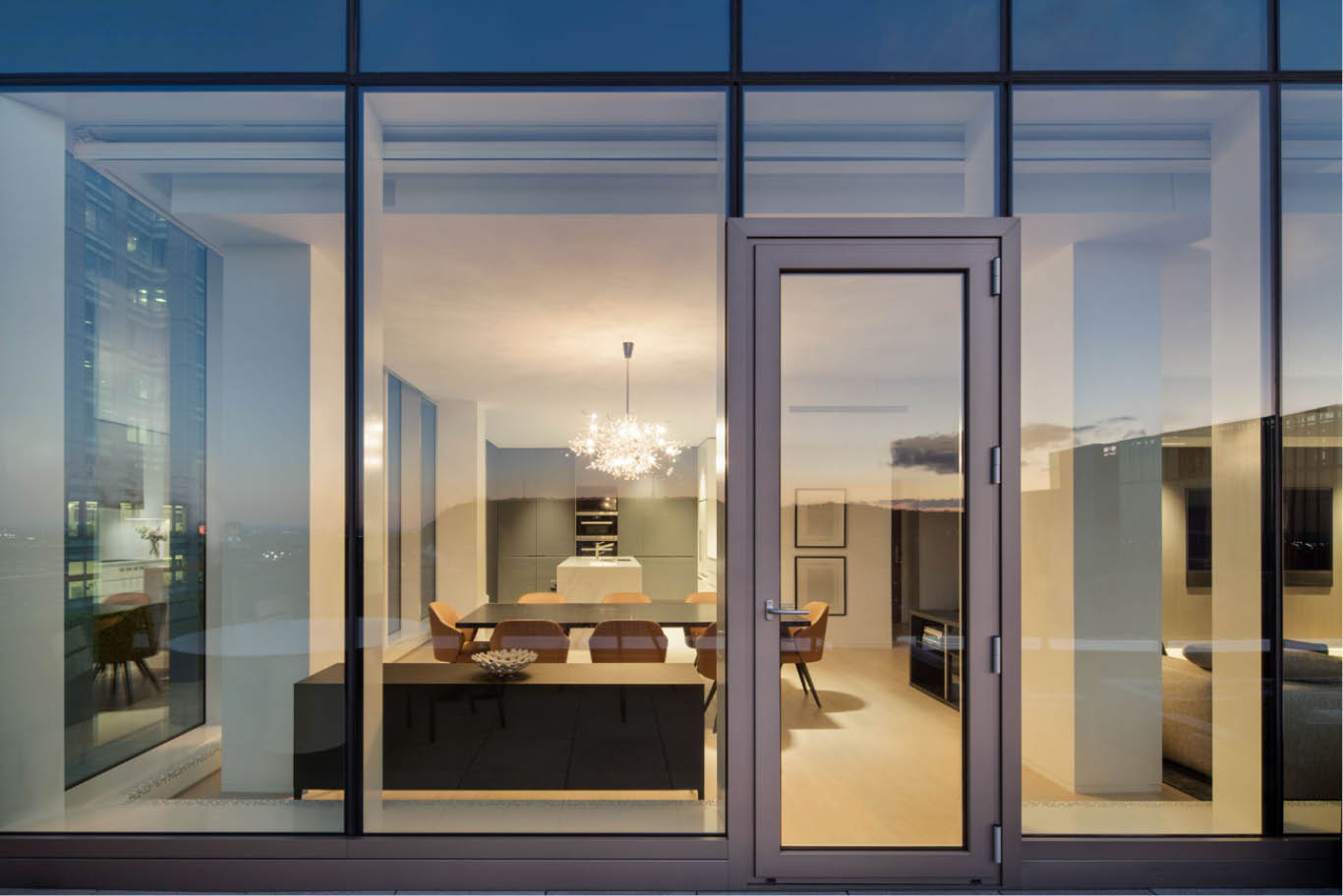
The open-plan living room connects to the kitchen via a large ebony table with seating for eight that serves as a nexus in the home’s coiled layout. In this sense, the table—with its overhanging lamp identical to those at the New York Metropolitan Opera—offers a direct view over the living room and the kitchen, which in turn provides a clear contrast between the spaces. Bright white hues have been selected for the kitchen, enhanced by the use of light technological quartz on the walls and island, opting for COMPAC Unique Calacatta™, and a dark grey for some of the fixtures. The polished minimalist look is thanks in part to the hidden pantry, built-in light fixtures and the subtle design of the tailor-made hood.
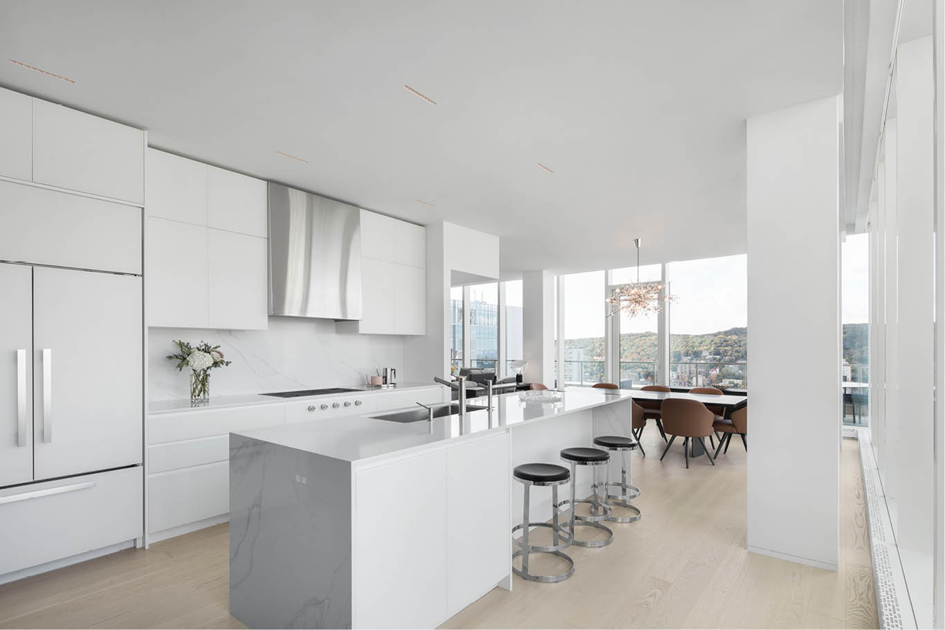
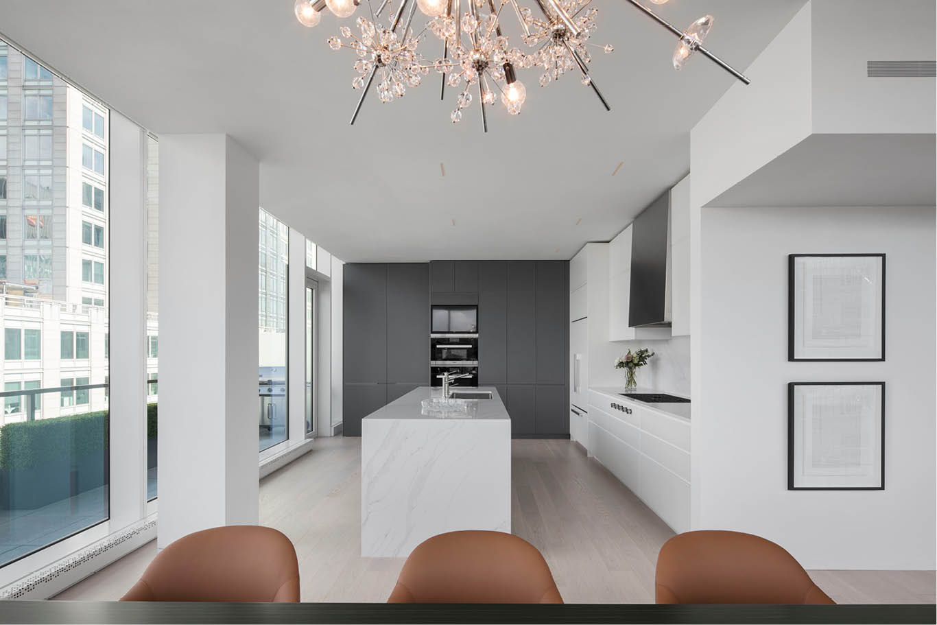
Technological quartz is also a main feature in the bathroom flooring, highlighting its beautiful organic grain throughout the space. The delicately curved bath tub is, without doubt, the eye-popping feature in the room. The home office is located behind the chimney wall, just off the living room, and has a warm, informal ambience that once again conceals all storage spaces behind the wall coverings. The space also has direct access to the terrace and interacts with the outside thanks to the glazed passage walls. It has also been designed for easy use as a guest bedroom. The lighting itself is worth a special mention. Besides the aforementioned exquisite lamp in the living room, the other light fittings are built-in and almost hidden, underscoring the importance of the natural light pouring in from outside the tower.
Photographs: Adrien Williams

