Architecture and interior design have, since time immemorial, been a reflection of how we design and inhabit spaces. Among the many different elements that interact in this art form, colour stands out as one of the most powerful and versatile. It is not simply about choosing attractive or fashionable shades. Colour palettes have the power to transform our perceptions, excite us, and impact human behaviour. In this article, we will explore how colours affect our perception of spaces. We will also examine how we can harness this knowledge to design settings that captivate the senses and satisfy the needs of those who live in them.
The psychology of colour: much more than a subjective science
To understand the impact of colour, it is vital that we delve into colour psychology. This discipline studies how different tones can influence emotions, moods and human decisions. The meaning behind a particular colour can vary depending on the culture and context. However, there are universal patterns that we can use when designing spaces.
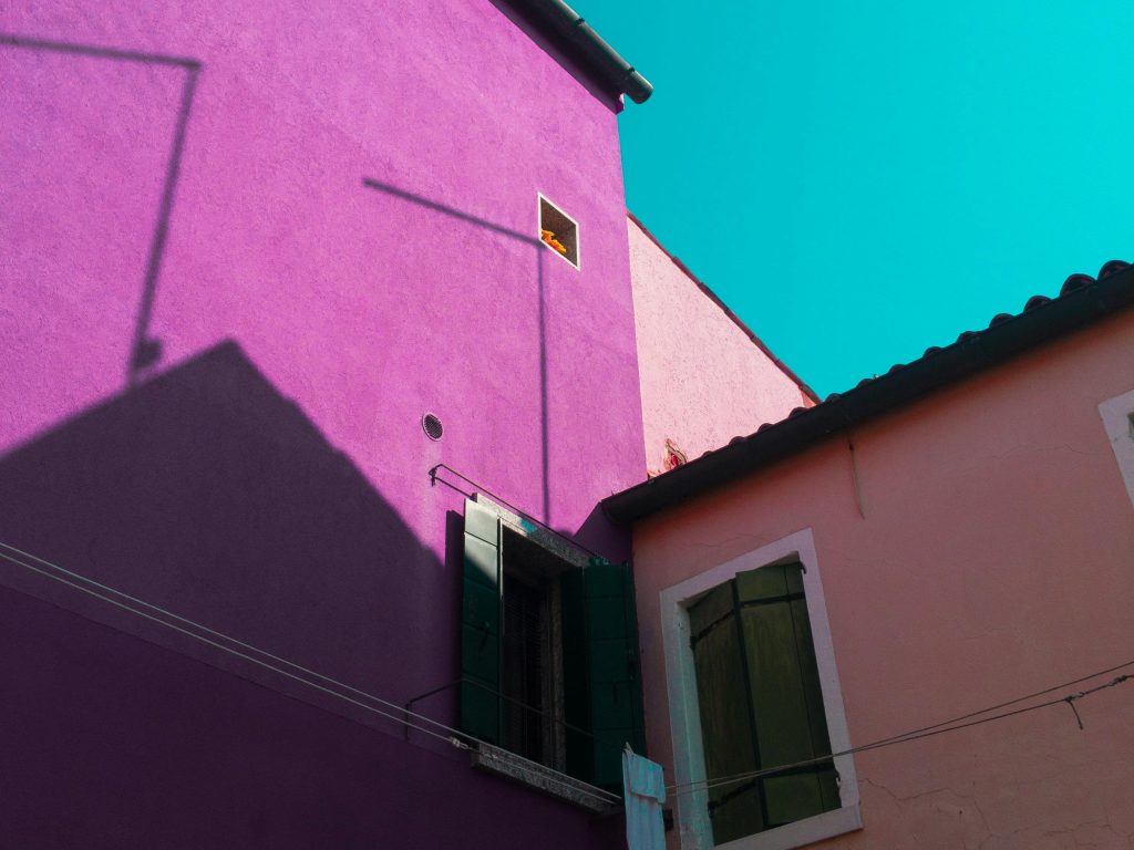
For example, warm colours such as red, yellow and orange are often associated with energy, enthusiasm and vitality. On the contrary, cold colours such as blue, green and purple inspire calm, tranquility and reflection. The colour palette can therefore affect how users perceive and experience a particular space.
Spaciousness and scale: how colours alter spatial perception
One of the main challenges in interior design is dealing with the perception of the space. As such, colours play a fundamental role. Light and neutral tones, such as white, beige or light grey, have the ability to visually expand a space, making it seem larger and brighter. This is as a result of their ability to reflect light, creating a sense of openness.

However, dark colours such as anthracite grey, navy or emerald green can make a space feel more intimate and cosy. This is ideal for rooms where we want to bring warmth and comfort, such as a bedroom or a sitting room.
Also, the strategic use of colour in ceilings, walls and floors can also impact how we perceive the height and proportions of a space. A ceiling painted in a colour that is darker than the walls can create a sensation of increased intimacy, whereas a white ceiling expands the perceived height.
The impact of colour according to the space
Every room has a specific purpose, and colour can strengthen its functionality. Let’s look at some examples:
- Kitchens and dining rooms: Warmer colours such as yellow or red can stimulate appetite and foster social interaction. However, it is important to use them to the appropriate degree to prevent them from becoming overwhelming.
- Offices and work spaces: Blue and green are perfect for encouraging concentration and creativity. These shades have a relaxing effect that helps to keep the mind
- Bedrooms: Soft, muted shades such as lilac, pearl grey or beige promote relaxation and rest.
- Bathrooms: Fresh, clean colours, such as white, light blue or mint green, create a feeling of purity and freshness.
The colour design must adapt not only to the function of the space, but also the individual preferences and needs of those who will use it.
Colour trends and their application in interior design
Fashion also influences colour choices. Current colour trends are focussed on creating balanced spaces that connect to nature and promote well-being. Some examples include:
- Earthy palettes: Tones such as terracotta, ochre and beige evoke warmth and comfort, connecting indoor spaces to the earth.
- Pastel colours: Soft tones such as sage green, sky blue and pale pink are perfect for creating delicate, relaxing settings.
- Bold contrasts: The use of bright colours such as mustard yellow or cobalt blue in combination with neutral tones brings dynamism and personality to a space.
- Black and white: This timeless combination continues to be a favourite in interior design, thanks to its ability to create an elegant, sophisticated contrast.
Incorporating trends effectively requires using them as a starting point, then adapting them to the specific context and needs of the project.
The role of materials in the perception of colour
Materials in a space also influence our perception of colours. The way materials’ texture, finish, and shape interact with light can significantly alter a colour’s appearance.
- Matt materials: These absorb light, which can make the colours seem deeper and softer.
- Shiny materials: These reflect light, intensifying the colour saturation and creating a feeling of energy.
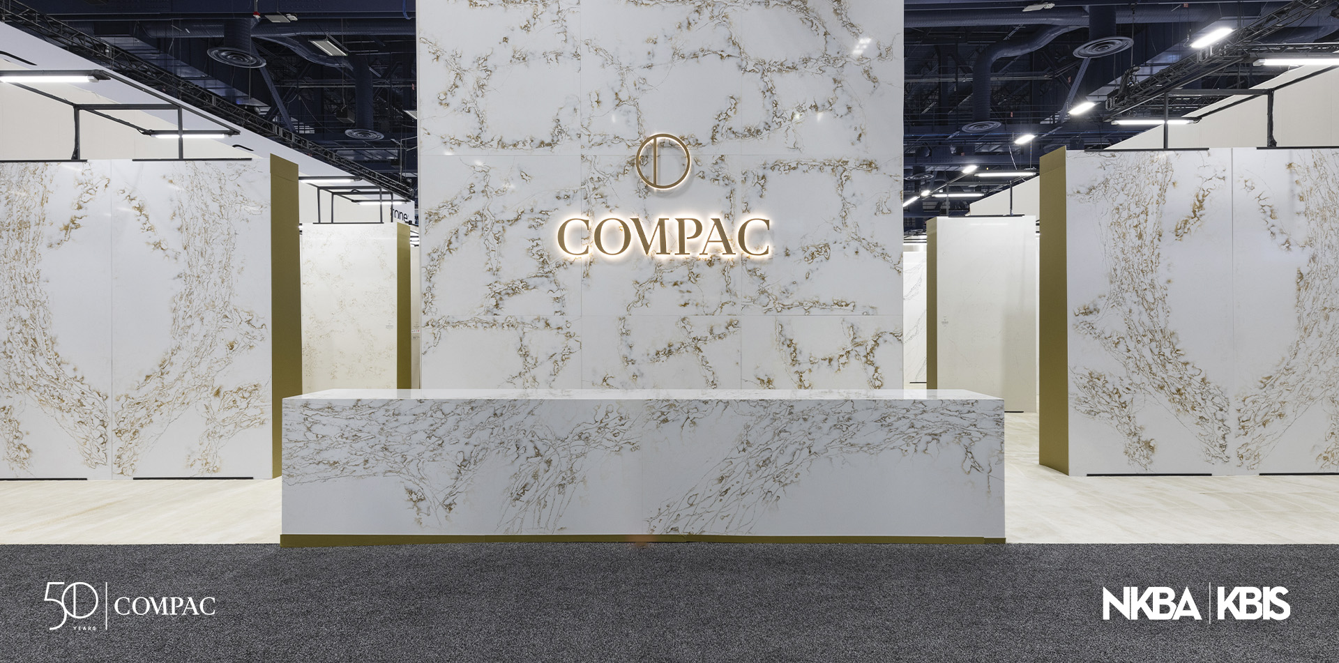
- Natural materials: Materials such as wood, marble or stone add a visual richness that complements the colour palettes, creating settings that are more organic and harmonious.
For example, a light wood floor combined with pastel-coloured walls creates a serene, welcoming ambiance, whereas a black marble surface can bring touch of luxury and sophistication.
Lighting and colour: an inseparable duo
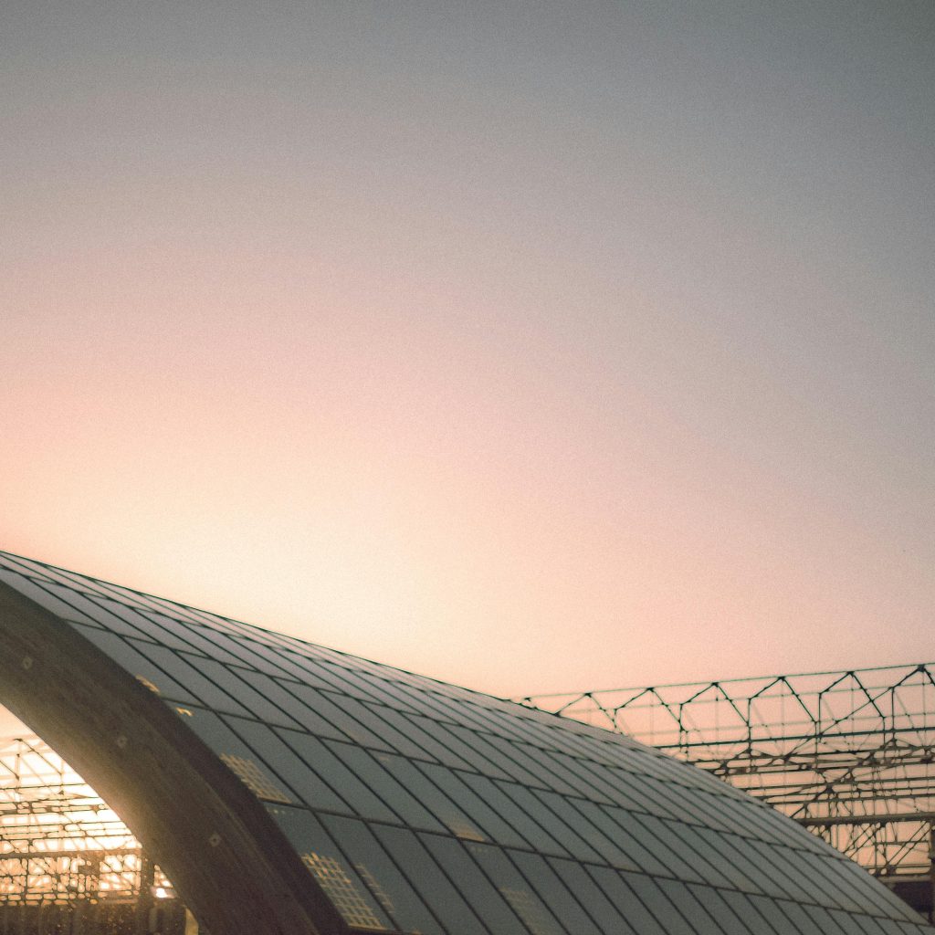
The perception of colour is closely linked to lighting. One particular tone can vary drastically depending on how a space is lit. Natural light, for example, tends to emphasise colours in a more faithful representation, whereas artificial light can alter the tone.
- Warm light: Highlights yellows, oranges and reds, creating a cosy
- Cold light: Favours blues and greens, creating a cleaner and more modern
- Spot-lighting: Used to highlight specific elements, such as an accent wall or a work of art, intensifying the impact of the colour.
Designing with colour involves considering how the lighting will interact with the chosen colour palettes, ensuring that the end result is harmonious and functional.
Conclusion: Designing spaces that transcend the visual
The power of colour in interior design and architecture transcends the merely aesthetic. Well-chosen colour palettes not only transform the perception of a space; they also impact the emotional and functional state of those who live in it. By combining colour psychology with a profound understanding of the materials, lighting and trends, we can create settings that are not only visually impactful, but that also resonate emotionally.
In the end, designing with colour is an art that demands sensitivity, understanding and a holistic vision. Whether it is a minimalist, vibrant or classic space, colour has the power to tell stories and stir up emotions. It is a tool that, when used well, turns spaces into experiences.