Being present is a human activity conditioned by the concept we have of what surrounds us. Without defining concepts for the action, what is experienced cannot make sense. Movement cannot be understood if the three essential elements that interlace what is comprehensible to what exists are lacking: body, time and space.
L’arrivée d’un train en gare de La Ciotat is an example of how images and film shots connect with spectators’ understanding of the world. The Lumière brothers linked their work to the reality of their viewers. They did so with a sublime perspective for the era that fulfilled the concept of space and time.
In each shot or depth of field, architecture has often been used as the determining element for expressing visual journey, movement or the environment. Great directors such as Fritz Lang started off studying architecture. This demonstrates how the discipline creates a solid focus for filmic shots. In this way, it creates a sensation interwoven with emotions that frame the plot of the film itself.
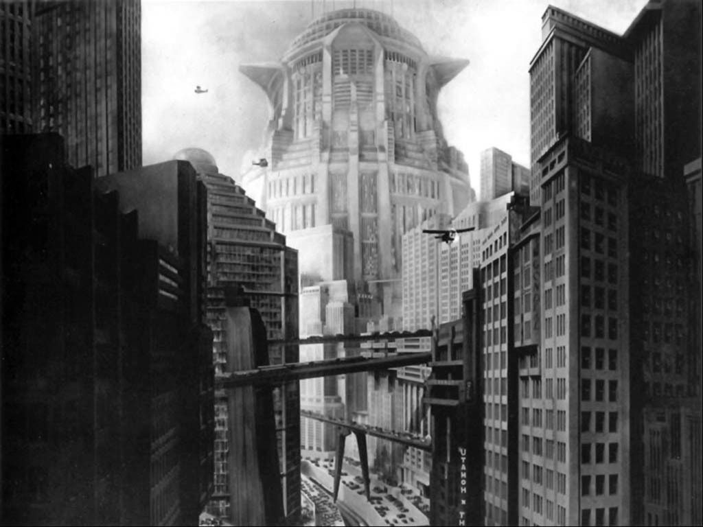
Fritz Lang created a chaotic urban reality for 2026 with a stratified city where different levels of society could be recognisedand each are represented by specific architecture.
The imaginary journey experienced by filmgoers is similar to the human perception of walking across a building. Here at The Decorative Surfaces, we take a look at the relationship between these creative disciplines through one of contemporary cinema’s greatest creators. He uses architecture and interior design as a crucial cinematic element to steer the general storyline in his works.
Wes Anderson’s spatial energy as inspiration in India
Wes Anderson’s cinematic career immerses spectators in elevation and symbolism through the director’s own aesthetic. As Lang before him, Anderson established a close relationship to architecture from his early beginnings.
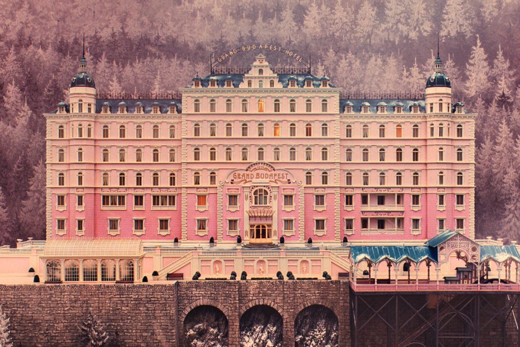
The Grand Budapest Hotel offers us an insight into how architecture and the director’s shots incite nostalgia and create mise-en-scène.
Architecture takes on a constant defining role for spectators that underpins the work that lies behind the spatial logic of the auteur. In this sense, his oeuvre takes up a unique space. During his film progress, maps, shots, elevations and sections are included that allow spectators to situate themselves alongside and within the storyline. Moreover, the relationship that the protagonists have with the space through interrupted movement aids spectators to journey through and comprehend the very same space alongside them.
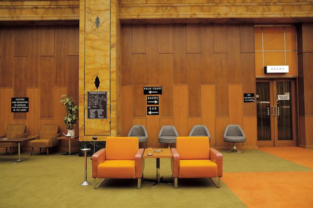
The symmetries and imbalances that Anderson uses in his shots based on architectural structures generate a precise flow that accompanies the emotions invoked by his stories.
Cinematic architecture
Directors use their own inherent references to what exists. Nevertheless, the expression itself and how Anderson connects reality to fantasy help us recognise it in any setting. In this sense, his extreme shot symmetry and colour palette can help situate us in any possible scenario. Whilst later serving as inspiration for architectural projects themselves.
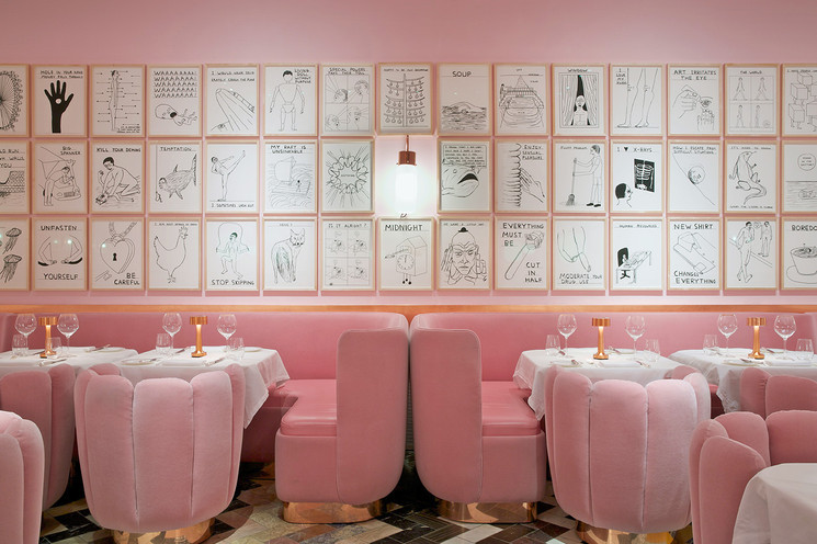
Sketch Restaurant, London. Image via Reddit user leprocto
This identification with cinematic magic can be seen at The Pink Zebra. This is a restaurant designed by Renesa Architecture Design Interiors Studio in India, which showcases a pure Anderson-style aesthetic. The playful interior lines create an atmosphere that straddles the fantastical and the tangible. Successive points create playful magical angles. These angles fire the imagination of visitors towards elevation and the logical final expression of the space.
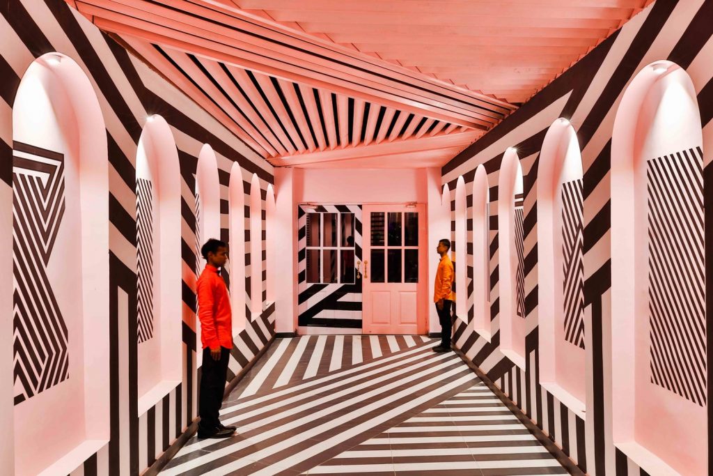
Sketch Restaurant, London. Image via Reddit user leprocto
In discovering this Anderson-esque atmosphere, visitors are faced with reality through tangible elements with a careful, silent yet powerful aesthetic. In this sense, and from a more functional bias, architecture and interior design projects are conjured that transpire into a clear visual magic so beloved by the director.
This is how Wes Anderson has become a benchmark for collective imagination. It has made him a successful inspiration for disciplines such as architecture and interior design.

