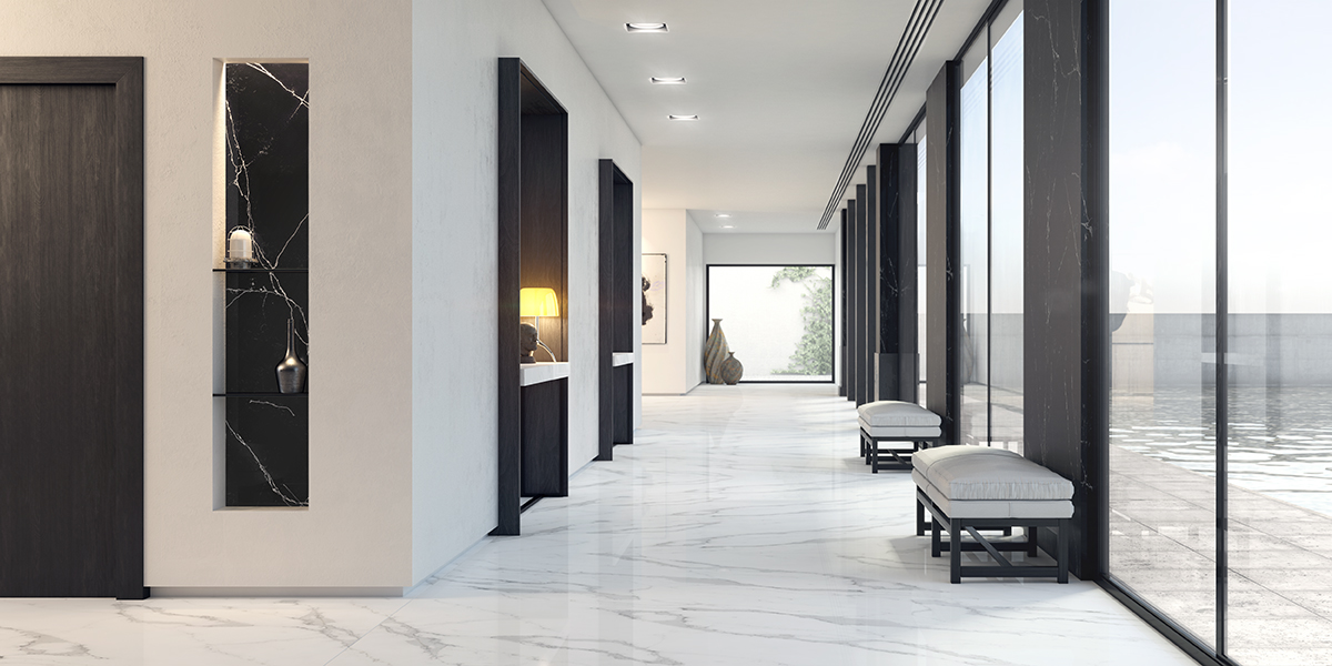
Working with colour has always been essential in interior design, as it has been a key element in the work of many architects and designers throughout the years. Gritte Rietvield’s “Schroder House”, Luis Barragán’s “Gilardi House”… are some of the designs that are based on a certain artistic movement or have been inspired by vernacular trends related to chromatic characteristics of certain cultural heritages. Each trend has been marked by the use of colour to some extent, as in the blurry tones of Romanticism, the primary colours used in neoplasticism or the bright colours of cubism.
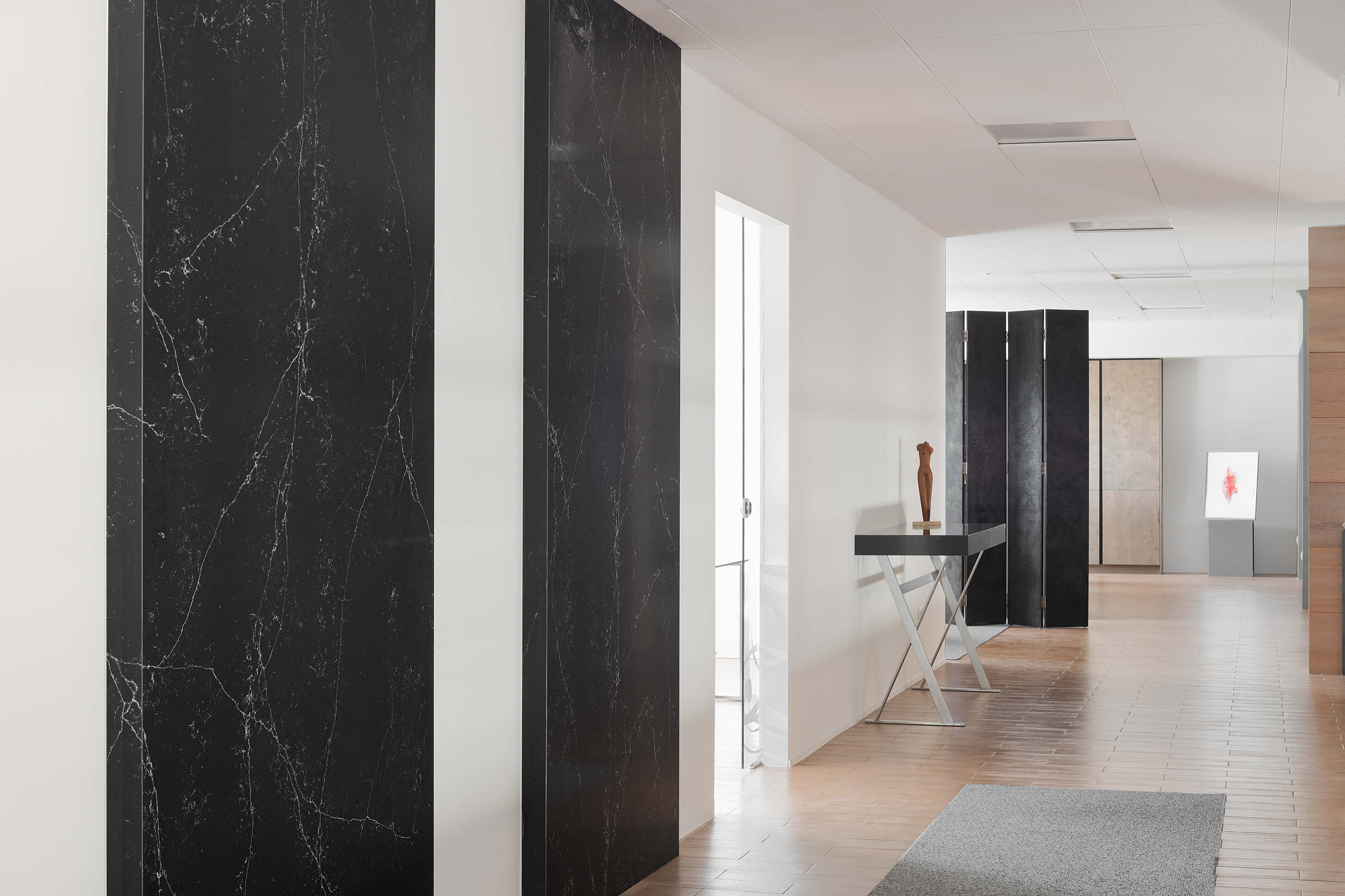 In one way or another, the world of design has always been intimately bound to colour, for it is capable of possessing and transmitting significance beyond the visual factor. With regards to interior architecture, while each trend has been characterised by certain chromatic combinations, there are some compositions that can be considered timeless thanks to their adaptability and simplicity. This is the case of the classic combination of black and white. The duality between these two tones -as well as their connotations of purity and perfection– has always been deeply admired, and has turned this combination into one of the cornerstones of artistic expression: iconography and symbology, photography, cinema…. In terms of interior design, this combination has been used by the best designers and architects in the world, and is still today one of the most popular choices.
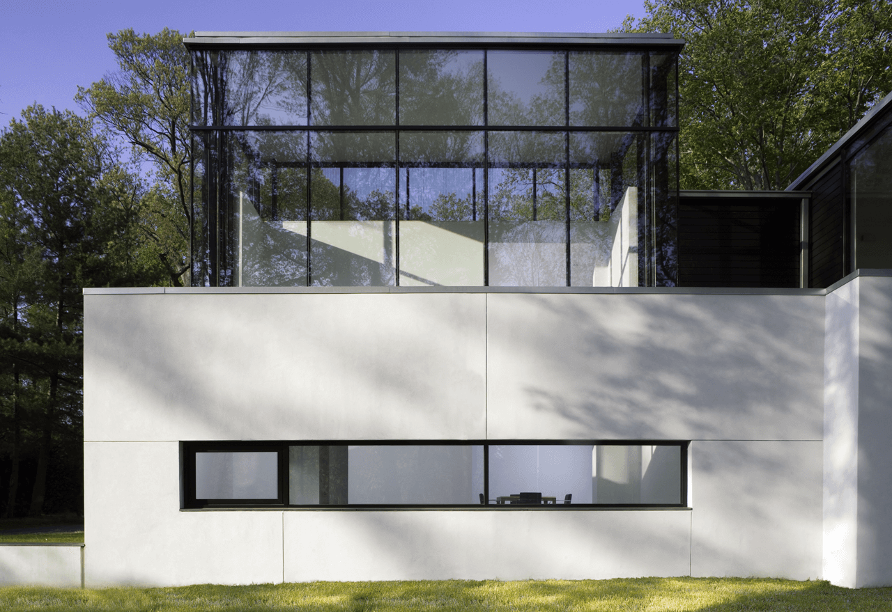
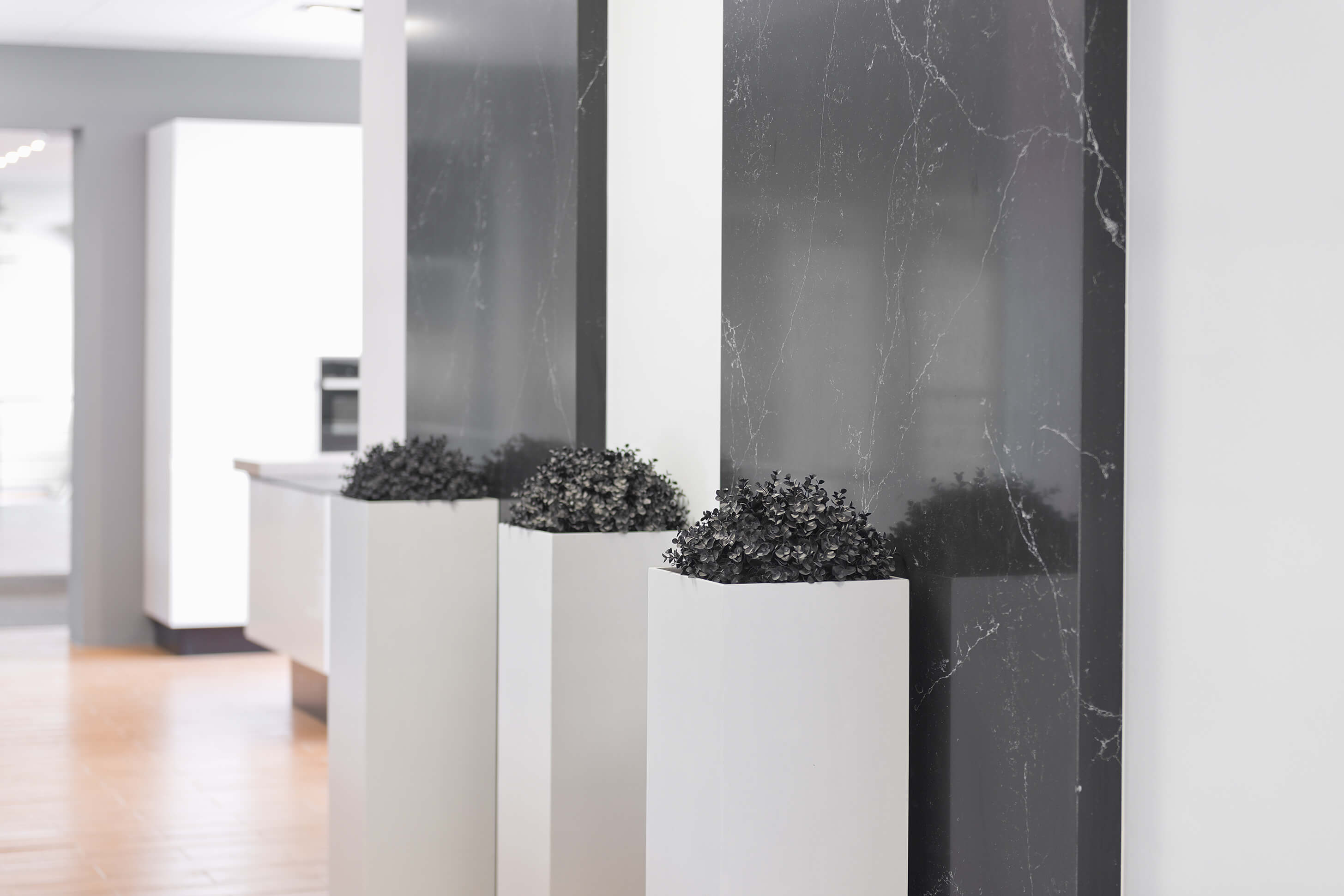 A very good example of interior design based on the combination of these two colours is the hotel bedroom designed by David Chipperfield for the hotel Silken Puerta América, in Madrid. Limiting the design to the essential, the architect perfectly combined these two colours through simple geometric shapes, generating great contrasts between the ceiling, the floor and walls. On a greater scale -but with a similar objective-, David Jameson was able to create in his Black White Residence an elegant contrast between ample interior spaces finished in light colours and the dark carpentries that frame the surroundings.
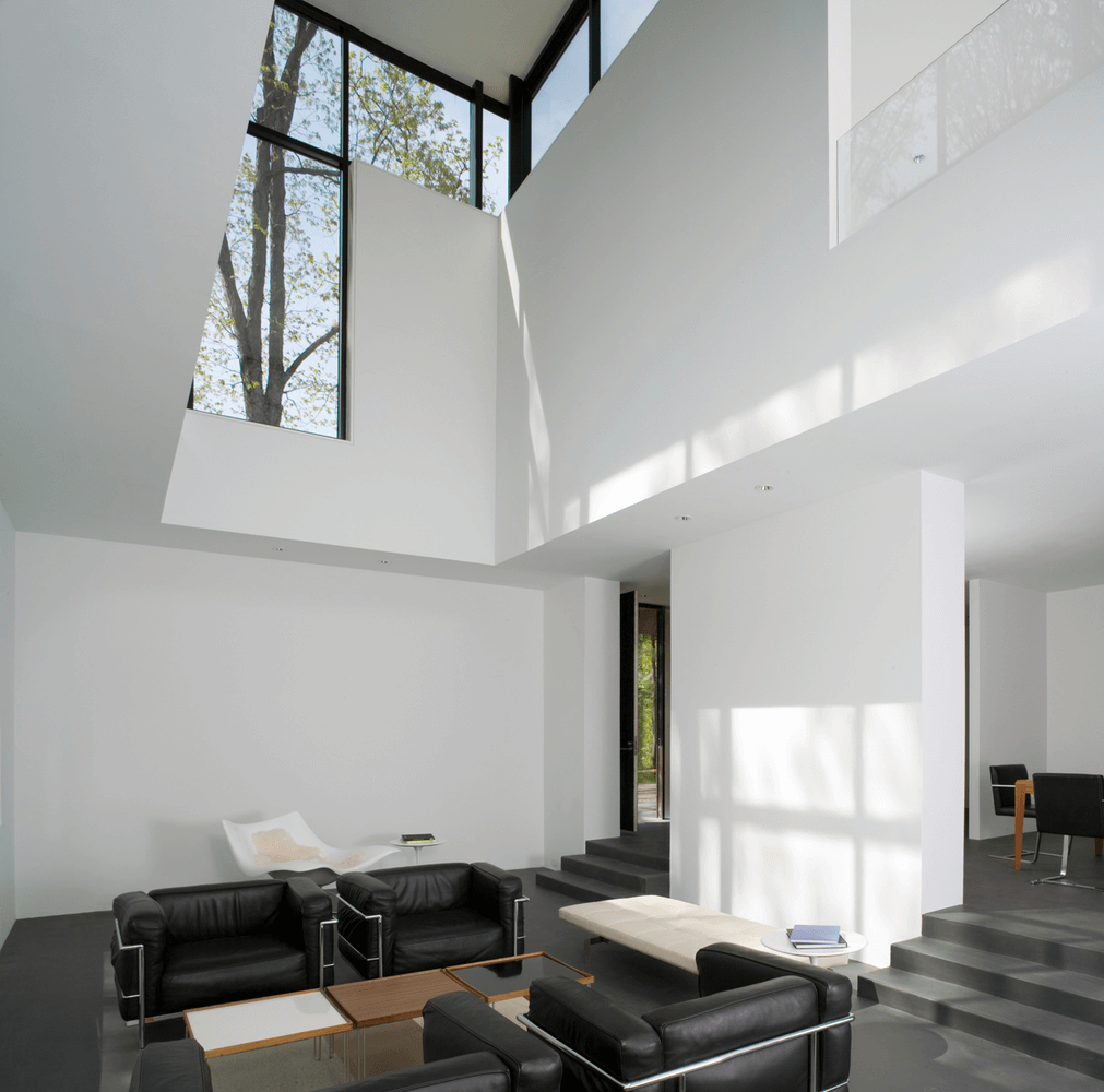
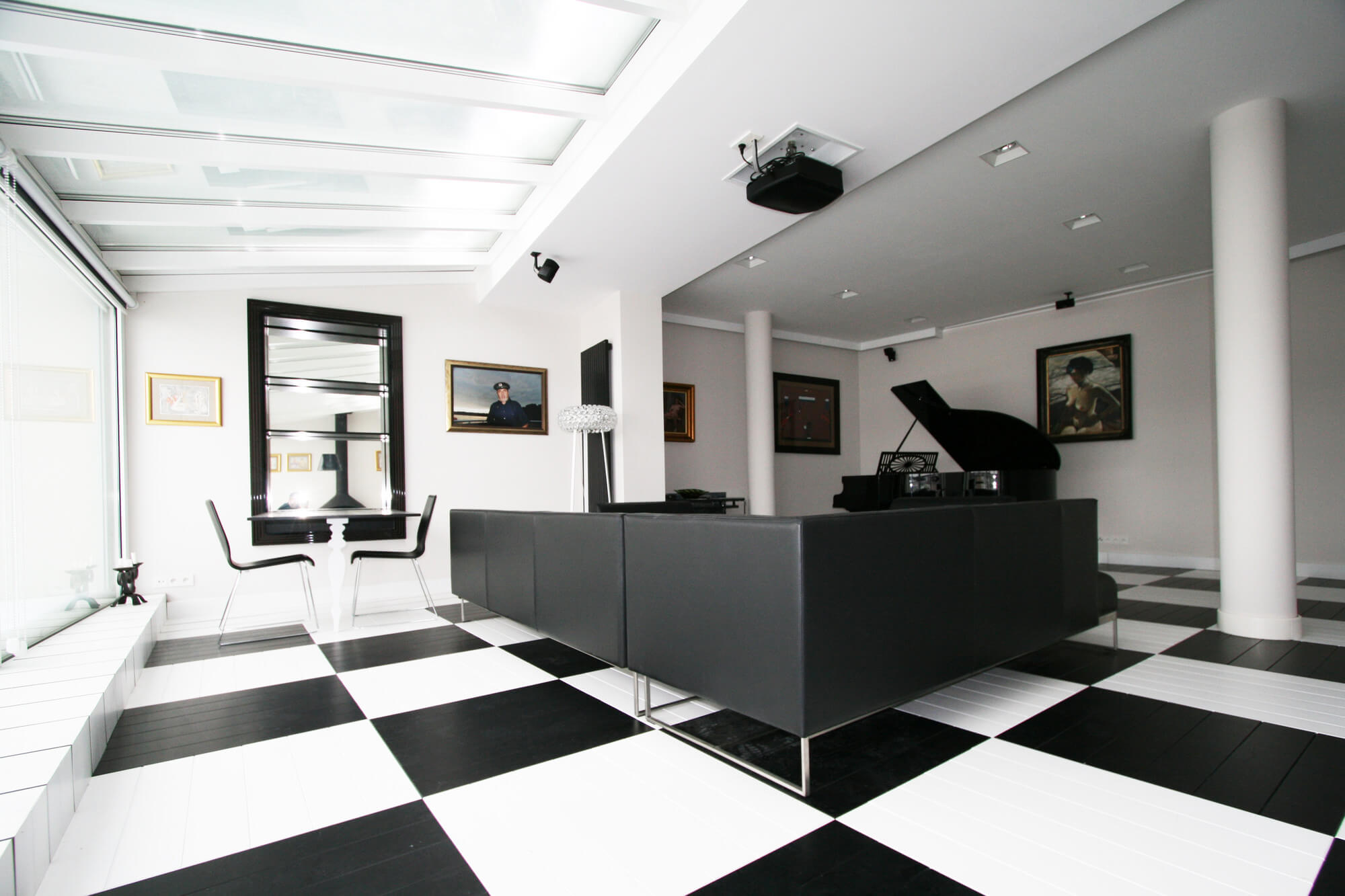
 Lastly, Toya Design carried out a bolder design with more dramatic contrasts in its Black and White Office in Konin, Poland. This architectural firm created a perfect bichromatic backdrop in which the client could be inspired to carry out his/her own artistic creativity. The key elements of this design: a checkerboard floor, black furniture contrasting with white walls and a grand piano as the star element in the room.
 Often, this duality can be achieved through the insertion of one single element within the space, whether it is a constructive element or a piece of furniture. Well known industrial designer Arik Levy shows the power of carefully choosing one key element that can completely turn around a design, as can be seen in his work titled ICE. In collaboration with COMPAC, this installation showcases the beauty and elegance of the company’s GENESIS collection, where black –ICE BLACK- and white –ICE WHITE- marble and quartz surfaces are the stars of the show. Arik Levy recreates, with the help of COMPAC’s petrous products, the icy reminiscence of the natural element, highlighting the contrast between the shining veins and the underlying tones of the material.
COMPAC has always managed not only to combine both beauty and functionality, but also to showcase the natural colour of stone, maximising the dual tonality this material can provide. The UNIQUE collection is a clear example of this company’s work, for it combines the purity and luminosity of white with the elegance and sophistication of black, intertwining the veining of the material in all its shades and textures into a single and unique piece. The subtleness and timelessness of COMPAC’s designs, as well as their capacity to emphasize the material’s aesthetic and technological characteristics as a whole is what makes this company one of the most exclusive designers and suppliers of stone products in today’s marketplace.

