There are works of architecture that are simply inspirational. Throughout the history of architecture, there have been moments that have changed the course of the future, sometimes the introduction of a new aesthetic style, and sometimes a technological evolution; the best architects in the world are able to draw upon their experience and use aesthetic and technology to deliver breathtakingly beautiful projects.
In this article we will analyse four buildings that have changed the face of architectural design through evolutionary thinking.
In pure architecture the smallest detail should have a meaning or serve a purpose.
– Augustus W. N. Pugin
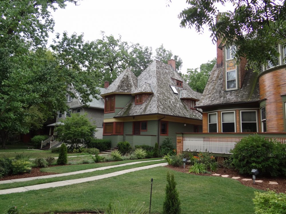 Frank Lloyd Wright – Thomas H. Gale House and Chauncey L. Williams Residence
Frank Lloyd Wright, largely considered to be the best architect in the world created all of his work in the United States. The eponymous prairie house, seen throughout the world in most American television shows, was not inspired the predecessors of Lloyd Wright but in fact by Japanese architecture of which Lloyd Wright was a self-proclaimed fan.
At the time in the 1890s, Japanese art was not readily available in the United States, and with Lloyd Wright not being formally trained in architecture, it gave him a base of inspiration upon which his designs would be based.
Japanese inspiration begets modern American architecture
You can see this Japanese influence in the minimalist styles of Lloyd Wright’s early architecture such as Thomas H. Gale House and Chauncey L. Williams Residence. The sloped rooves and cross shaped foundations had not been seen in the United States previously. It was the inspiration that Lloyd Wright from Japanese architecture and Japanese art that would go on to inspire his own style, and that of the architects that would follow him in later years. His designs became the foundations upon which architects ever since have based their designs.
 Norman Foster – 30 St Mary’s Axe
The crowning achievement of Norman Foster’s illustrious career is the building more commonly known as The Gherkin. There is not one straight line in its exterior. Its positional relation reflects its natural context due to its audacious location amongst the straight lines of London’s City area. But the true pioneering difference in this building is how computer aided design and algorithms were used to create it.
More than its relativity and aesthetic context, 30 St Mary’s Axe is a building that without modern spatial programming software would not have been possible. Using parametric modelling software, Foster’s team are able to calculate stresses upon the structure working from top to bottom, any slight alteration to any part of the building would create a knock-on effect that would require reshaping in another part of the building to compensate, this is all done via powerful software, and uses technical programming to create simplicity.
Caad brings a new era of form and shape to skyscrapers
In contrast to the Guggenheims of Lloyd Wright and later Gehry, the Gherkin holds back its true technical wizardry and remains an understated building, which a layman may look at as normal, but without the intricacy of it parameter driven design, it would be impossible to build, or even to conceive.
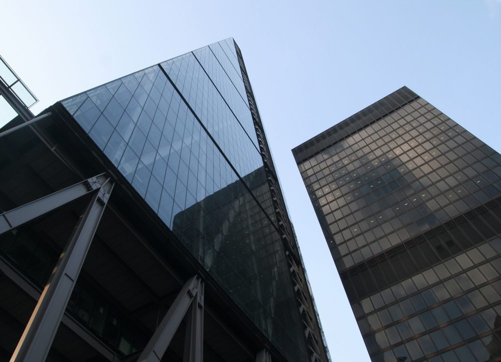 Richard Rogers – The Leadenhall Building
The building which cemented Richard Rogers’ notoriety was the Lloyds Building in the City of London. Though less talked about, though no less acclaimed, the Leadenhall building right across the street is a pure architectural triumph.
Designed to pay respect to St Paul’s cathedral, the building tapers away from the cathedral to allow unaffected viewing of London’s most famous site. It is a respectful bow to the existing architecture of London’s skyline.
So why is this relatively plain-looking building so innovative?
A leap forward in structural design through the omission of a central core
Fundamental to this building its lack of a central core. The building is designed around a “tube” frame envelope, with an exterior skeletal structure providing further support. This allows for the maximum amount of floor space and the lower floors have very few pillars or supports. This makes for a trading floor style environment, at a very high level with clear views of St Paul’s Cathedral and the Lloyds Building.
This form reflects perfectly the context of the building; right in the centre of The City, bankers, insurers and financiers are able to meet and do business without travelling more than a kilometre. The need for space in this area makes for huge demand and high real-estate costs; in 2011, three years before the building was opened, 50% of the offices had already been purchased or let.
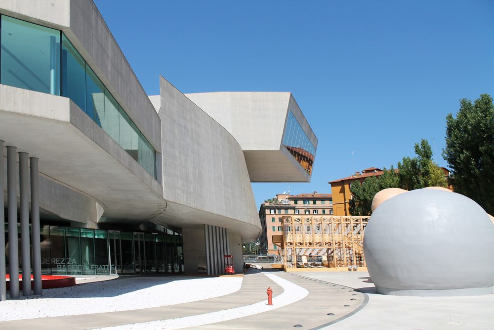
Zaha Hadid – MAXXI
To reflect the cultural shift in the Italian art world, from the old-world paintings of Florence to the modern-art of Arcangelo Sassolino and Gio Ponti, a building would need to be perfect in every sense.
The MAXXI museum is public owned and was a landmark initiative by the Italian government to show a renewed interest in reviving the prestige of Italian Art.
An artistic reflection of modernism
The building itself follows modernist themes that can be found in Gehry’s Guggenheim and Calatrava’s Palacio de La Reina Sofia. The exterior uses exposed concrete as its material of choice, and the limited number of materials reflects the minimalism of the building and its contents.
The inspiration that Hadid has taken from predecessors results in an exploration of fluid lines and “angular” roofing. Architecturally, like the modern art it hosts, the building blurs the lines between inside and out, with outdoor spaces flowing beneath arches and over bridges from hall to hall, allowing guests to take in the artworks and experience variety in the surroundings.

